01 Asymetric
Asymetric is the
brainchild of four SCAD students in an exercise to create a fictitious design
studio that highlights our strengths as artists and upholds our personal design
philosophies. It’s a group project in the truest sense, combining all our
styles under one cohesive roof, literal and figurative.
Process Book
Process Book


02 Coffee for Compost
Advertising, branding
& visual identity
& visual identity
Coffee for Compost is a fictional community rewards program set up by GrowNYC benefiting the community gardens scattered across New York City. In this program, members of any community garden pick up coffee grounds (and other compost) from local participating coffee shops for use in their own garden. Not only will they receive compost, but in return they can collect rewards for frequenting these shops.
The goal is to make users feel like not only themselves but also the city as a whole could benefit from using the program. Friendly competition plays a role when considering that gardeners who gather the most benefits and points may be eligible for exclusive deals.


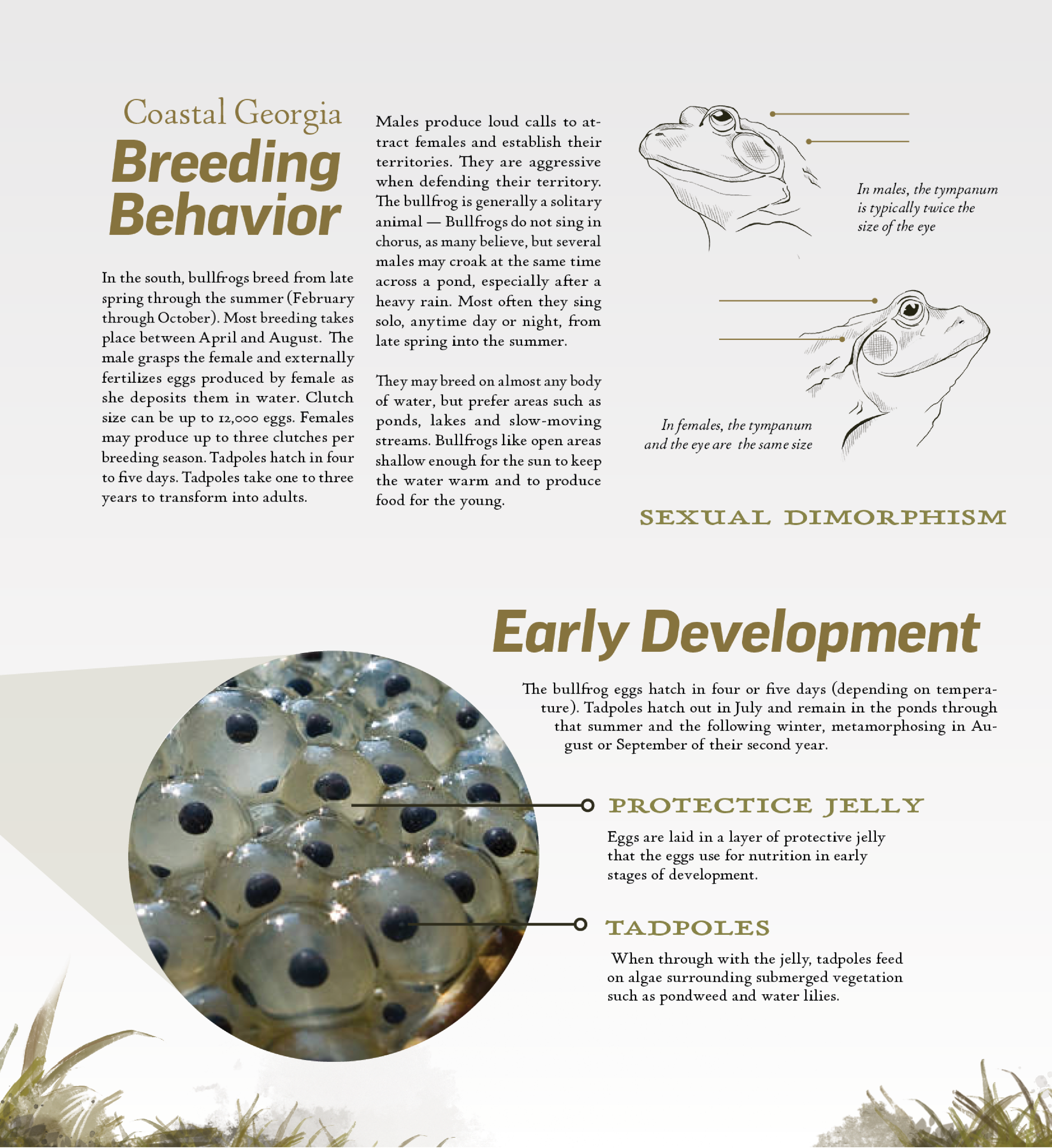
04 The American Bullfrog
Information illustration
& infographics
& infographics
The American Bullfrog is a series of illustrations, infographics, and displays created for an exhibit in an amphibian house, intended to frame an enclosure for additional reading and learning material for guests. Zoos and aquariums are places of education: the goal of each sign is to make an easy-to-read, informative display of information utilizing illustration, photography, and typography.
Process Book


Detail View:


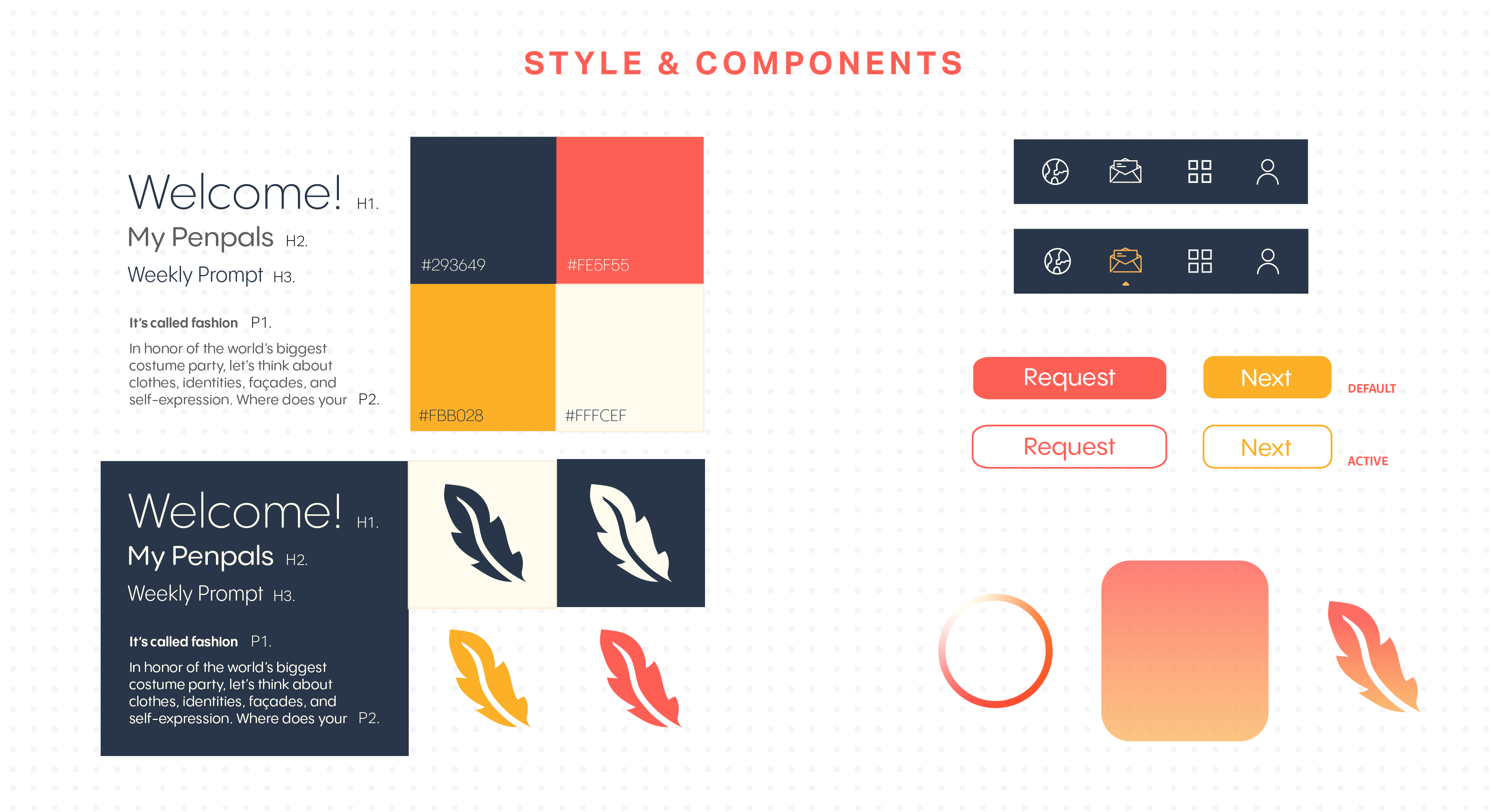
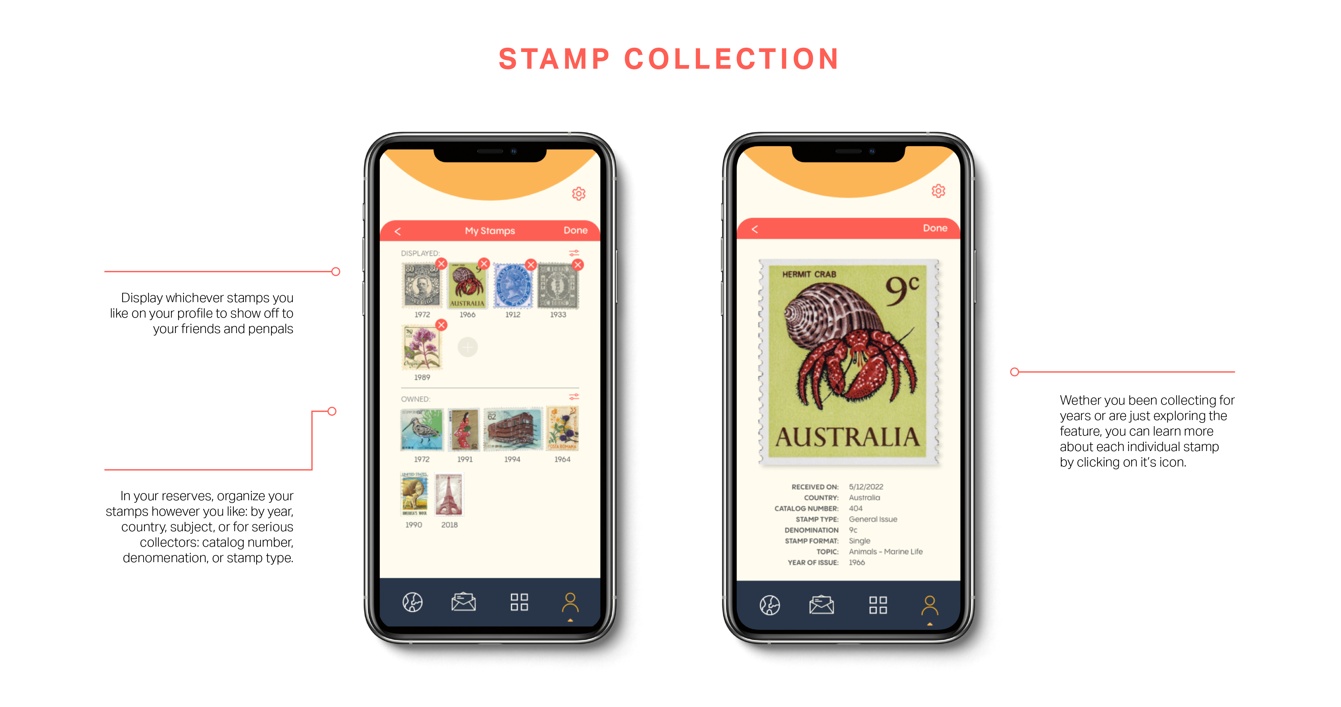
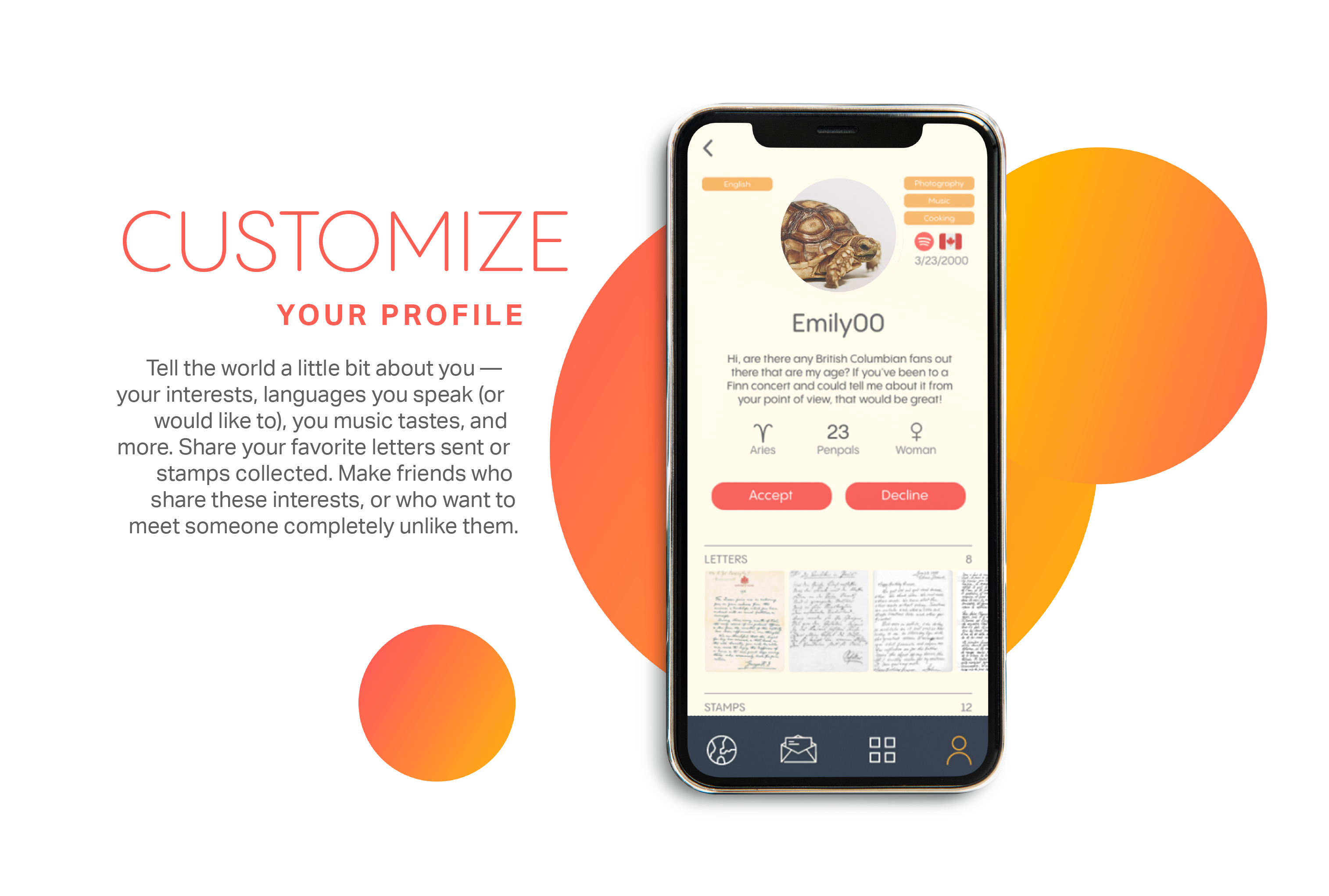
03 Post Scriptum
Post Scriptum is an app designed to reimagine the penpal for the 21st century, without losing the charm and virtues of traditional snail mail. Our team wanted to design an app for everyone, bringing them together in a one-on-one connection. The mission? To rethink the way we communicate with people by combining the physical roots of mail with a digital application in an intuitive, secure interface.
When designing the app, the focus was on creating an interface that was accessible to people of all ages and backgrounds. Accessibility features are prominent throughout the app, including photo and text scanning, voice messages, and or a dark mode for more contrast.
Process Book Prototype Video
When designing the app, the focus was on creating an interface that was accessible to people of all ages and backgrounds. Accessibility features are prominent throughout the app, including photo and text scanning, voice messages, and or a dark mode for more contrast.
Process Book Prototype Video


06 Sunny Side
Branding, visual identity,
& print production
& print production
Sunny Side is a fictional Bed & Breakfast located in the small college town of Middlebury, Vermont. Its principal concept is to introduce guests to the world of homesteading and farm life in a quaint, personal environment, but without compromising on the guest experience.
The brand’s design is inspired by vintage, hippie, and Western styles, emphasizing handmade and hand-drawn elements. To that end, the style is slightly cleaner and more minimalistic, which is appropriate for a hotel or bed and breakfast. The logo is a simple sun rising over a rooftop, with an added rustic texture when allowed. This textural treatment is carried through other aspects of the type and graphic elements to tie everything together.
Process Book